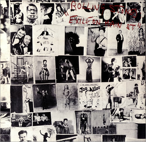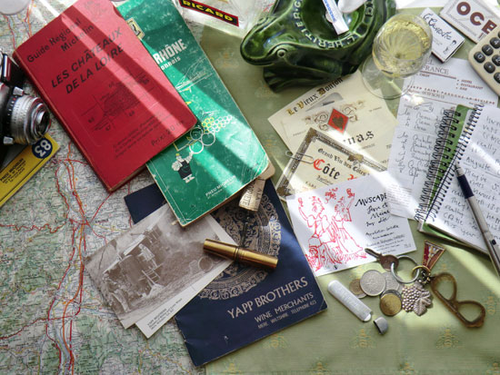
I had great fun composing the montage for this year’s list cover in homage to my Dad, Robin Yapp, loosely inspired by classic 1970s album covers such as (the inside sleeve) of Eric Clapton’s Slowhand and the Rolling Stone’s seminal Exile on Main Street. Appropriately I took the shot on the inside sill of Robin’s kitchen window which gets great natural light on a summer’s morning. The camera I used was a Nikon D80 SLR which made a stark contrast to Dad’s old Zeiss Iron ‘Contaflex’ that can be seen to the extreme left of the picture. He may well have used that camera to take the wonderful, sepia, mid 1970’s picture of my sister Arabella standing on a fully functional alambic sporting a providentially nostalgic Laura Ashley dress, that can be seen on the postcard on the left-hand side. The dark navy wine list in the centre dates from 1971 back in the days of 3 digit phone numbers.

The well-thumbed books and maps are all from the parental archive and I selected a view showing Valence and Tain L’Hermitage as that is undoubtedly the page that we have most traversed over the last 43 years. The wine labels are 4 personal favourites – Quentin Blake's inimitable Muscadet illustration, a classic, gothic Côte Rôtie from Jasmin and Cornas from Clape and ‘Le Vieux Donjon’ in Châteauneuf-du-Pape. The frog ashtray (from Dijon) cicada tablecloth (from Saint-Rémy-de-Provence) and Ricard picher (can’t remember) are all Francophile ephemera accrued over many years. The grape key-ring is Robin’s own and comes from O & H Bour in Tricastin, the Jarraud glasses and Eifel tower key rings and ‘Usines du Rhône’ aspirin case were all junk shop finds.
To fully qualify for ‘anoraks’ corner’ I can tell you that wine in the glass was a Cassis: Clos Sainte Magdeleine 2009 and the restaurant bill is from the superb Hôtel du France in Saint- Pardoux-La Rivière but don’t all rush there at once. The spiral note books are my own and the open page records a visit to see Auguste Clape in Cornas. The fountain pen is a Parker 25, a design classic and the only model style-conscious schoolboys would be seen with in the 1970s. The calculator is my own Sharp Elsi Mate EL 392L – not an object I could in anyway endorse except for its tenacious longevity. The tooth-pick and matchbox are both originals from Le Gavroche – our old friend Silvano Giraldin must have got a good deal on a job lot back in the day. The corkscrew is a brass pocket model from Yapp Brothers’ burgeoning collection and the francs were kicking around at the bottom of a drawer in the office along with a vintage copy of Penthouse that is almost certainly Robin’s own although he is bound to deny that! There is no justifiable reason for including the packet of OCB cigarette papers (top right) other than they look good and the font is fabulous. On the subject of fonts (might need a second anorak here) I am deeply indebted to my annual collaborator graphic designer Andy Batchelor (at www.blackmore.co.uk) for unearthing the Albertus typeface from our 1971 list and adding the ‘YAPP 2012’ text as well as some very subtle toning which gives the whole image a warm, retro feel.

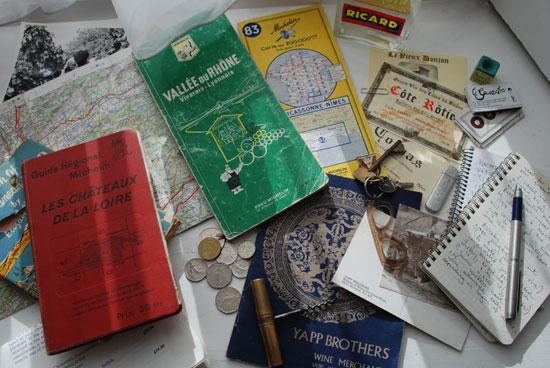
You can see from this early draft that a picture like that doesn’t come together in an instant and although I nearly drove myself bonkers trying to get the definitive shot I am now, several months later, happy with the end result.
Any (sensible) suggestions on how we illustrate next year’s list will be gratefully received.


